Category
UI/UX Design, Redesign, Insurrance
Responsibility
UI/UX, Flow Design, Prototyping, Design System
Zurich Insurance Purchase Flow Redesign
Zurich Insurance Purchase Flow Redesign
Zurich Insurance Purchase Flow Redesign
Zurich Indonesia offers dozens of insurance products, from vehicle to business protection, but the path to actually purchasing one on the website consistently stalled midway. I worked on two core areas, redesigning the purchase flow that previously only funneled users into a leads form into a transaction that could be completed end to end, and restructuring the homepage.
Zurich Indonesia offers dozens of insurance products, from vehicle to business protection, but the path to actually purchasing one on the website consistently stalled midway. I worked on two core areas, redesigning the purchase flow that previously only funneled users into a leads form into a transaction that could be completed end to end, and restructuring the homepage.
Problem insights
Problem insights
Problem insights
Insurance is a high trust product category, and customers need to feel confident before paying. The issue was that Zurich's existing design treated "building trust" and "completing a transaction" as two separate, equally incomplete processes: the homepage built trust through company credibility but lacked of customer testimonial, while the purchase flow exited the system entirely the moment the leads form was submitted.
This led to the core insight: trust and transaction need to be designed as one continuous flow, rather than being redirected to another channel with unpredictable response times.
Insurance is a high trust product category, and customers need to feel confident before paying. The issue was that Zurich's existing design treated "building trust" and "completing a transaction" as two separate, equally incomplete processes: the homepage built trust through company credibility but lacked of customer testimonial, while the purchase flow exited the system entirely the moment the leads form was submitted.
This led to the core insight: trust and transaction need to be designed as one continuous flow, rather than being redirected to another channel with unpredictable response times.
Approach
Approach
Approach
Redesign homepage structure
Redesign homepage structure
Simulation and automatic product recommendations
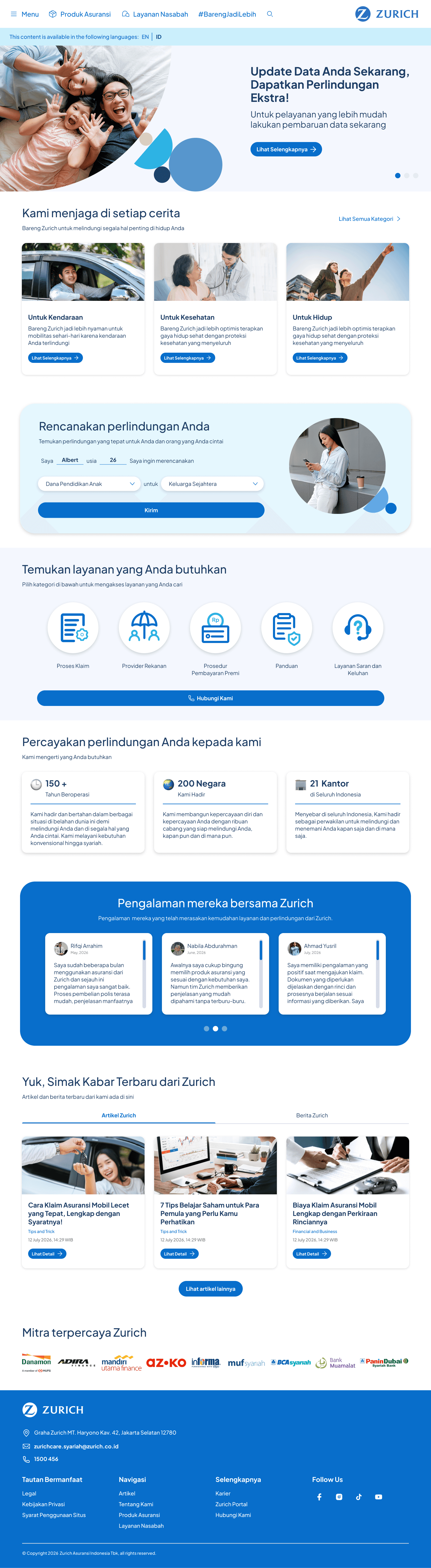
Beyond the product page, I also brought a simulation component into the homepage, but with a different purpose. This homepage simulator is designed for users who don't yet know which product fits their needs. It takes the form of a short homepage input: name, age, and the need they want to plan for, Once submitted, the system will surfaces the products most relevant to the need they just described.
Simulation and automatic product recommendations
Beyond the product page, I also brought a simulation component into the homepage, but with a different purpose. This homepage simulator is designed for users who don't yet know which product fits their needs. It takes the form of a short homepage input: name, age, and the need they want to plan for, Once submitted, the system will surfaces the products most relevant to the need they just described.
Why this matters?
Zurich's product range is extensive, insurance vehicle, health, investment, property, business, and life protection, each with multiple variants. For a new prospective customer unfamiliar with the brand, a catalog this large can trigger choice overload, especially when they open this website with only a general need in mind, rather than a specific product name in mind.
Why this matters?
Zurich's product range is extensive, insurance vehicle, health, investment, property, business, and life protection, each with multiple variants. For a new prospective customer unfamiliar with the brand, a catalog this large can trigger choice overload, especially when they open this website with only a general need in mind, rather than a specific product name in mind.
Adding customers testimonial
Adding customers testimonial
The corporate figures section (150+ tahun, 200 negara, 21 kantor) was retained, as it remains relevant as a marker of scale and stability. However, I added a new section immediately after it: Pengalaman mereka bersama Zurich" a carousel of genuine customer testimonials.
This section is deliberately placed after the corporate figures rather than before, because the sequence is designed to build trust progressively.
The corporate figures section (150+ tahun, 200 negara, 21 kantor) was retained, as it remains relevant as a marker of scale and stability. However, I added a new section immediately after it: Pengalaman mereka bersama Zurich" a carousel of genuine customer testimonials.
This section is deliberately placed after the corporate figures rather than before, because the sequence is designed to build trust progressively.

Product cards with hover details
Product cards with hover details
On the product listing page, product cards previously showed only an image and product name. Ccustomers had to click into the detail page just to see the key benefits. I added a hover interaction: when a card is hovered, it reveals key selling points. The goal is to let customers scan the strengths of several products at once.
On the product listing page, product cards previously showed only an image and product name. Ccustomers had to click into the detail page just to see the key benefits. I added a hover interaction: when a card is hovered, it reveals key selling points. The goal is to let customers scan the strengths of several products at once.
Redesign product purchase flow
Redesign product purchase flow
I restructured the product purchase flow to Simulasi Premi → Screening Kesehatan → Data Diri → Review → Pembayaran. Customers always know exactly which stage they're on and how many steps remain something completely absent from the previous flow.
In the existing flow, users had to wait for an agent just to get a rough premium estimate. I redesigned Premium Simulation into an Simulasi Premi. Customers input gender, date of birth, number of covered family members, and desired coverage amount via a slider, and receive an instant premium estimate without waiting on anyone.
I restructured the product purchase flow to Simulasi Premi → Screening Kesehatan → Data Diri → Review → Pembayaran. Customers always know exactly which stage they're on and how many steps remain something completely absent from the previous flow.
In the existing flow, users had to wait for an agent just to get a rough premium estimate. I redesigned Premium Simulation into an Simulasi Premi. Customers input gender, date of birth, number of covered family members, and desired coverage amount via a slider, and receive an instant premium estimate without waiting on anyone.
Health screening that's upfront about the consequences
For health products, there's a health condition declaration step. I deliberately placed a yellow notice at the bottom explaining that inaccurate answers can lead to a rejected claim down the line. This matters so customers answer truthfully from the start, not just to get past the step.
Health screening that's upfront about the consequences
For health products, there's a health condition declaration step. I deliberately placed a yellow notice at the bottom explaining that inaccurate answers can lead to a rejected claim down the line. This matters so customers answer truthfully from the start, not just to get past the step.
Personal data form with validation and clear upload guidance
The personal data form such as KTP, NIK, foto KTP, foto diri dengan KTP includes helper text on every field and a "Lihat Contoh" link for photo uploads, preventing customers from submitting incorrectly formatted or blurry photos that would force them to redo the step.
Personal data form with validation and clear upload guidance
The personal data form such as KTP, NIK, foto KTP, foto diri dengan KTP includes helper text on every field and a "Lihat Contoh" link for photo uploads, preventing customers from submitting incorrectly formatted or blurry photos that would force them to redo the step.
Review screen and payment with multiple methods
Before payment, all submitted information is summarized on a single review screen. Customers can verify everything and still edit any section.
The final step offers 4 payment methods with step by step instructions and a clear cost breakdown plus a timer so customers know exactly how much time they have before the session expires.
Review screen and payment with multiple methods
Before payment, all submitted information is summarized on a single review screen. Customers can verify everything and still edit any section.
The final step offers 4 payment methods with step by step instructions and a clear cost breakdown plus a timer so customers know exactly how much time they have before the session expires.
Project impact
Project impact
Project impact
• Policy purchases no longer depend on agent response time to get a premium estimate, submit data, or track progress and the entire process can be completed independently on the website.
• Premium estimates are now instant, eliminating the waiting period that previously made it easy for prospective customers to lose interest before completing the process.
• The homepage now carries two layers of trust at once.
• Faster comparison: Hover details help users compare products without extra clicks.
• Guided discovery: A needs simulator directs new customers to relevant products instead of browsing a large catalog.
• Policy purchases no longer depend on agent response time to get a premium estimate, submit data, or track progress and the entire process can be completed independently on the website.
• Premium estimates are now instant, eliminating the waiting period that previously made it easy for prospective customers to lose interest before completing the process.
• The homepage now carries two layers of trust at once.
• Faster comparison: Hover details help users compare products without extra clicks.
• Guided discovery: A needs simulator directs new customers to relevant products instead of browsing a large catalog.
Category
UI/UX Design, Redesign, Insurance
Responsibility
UI/UX, Flow Design, Prototyping, Design System